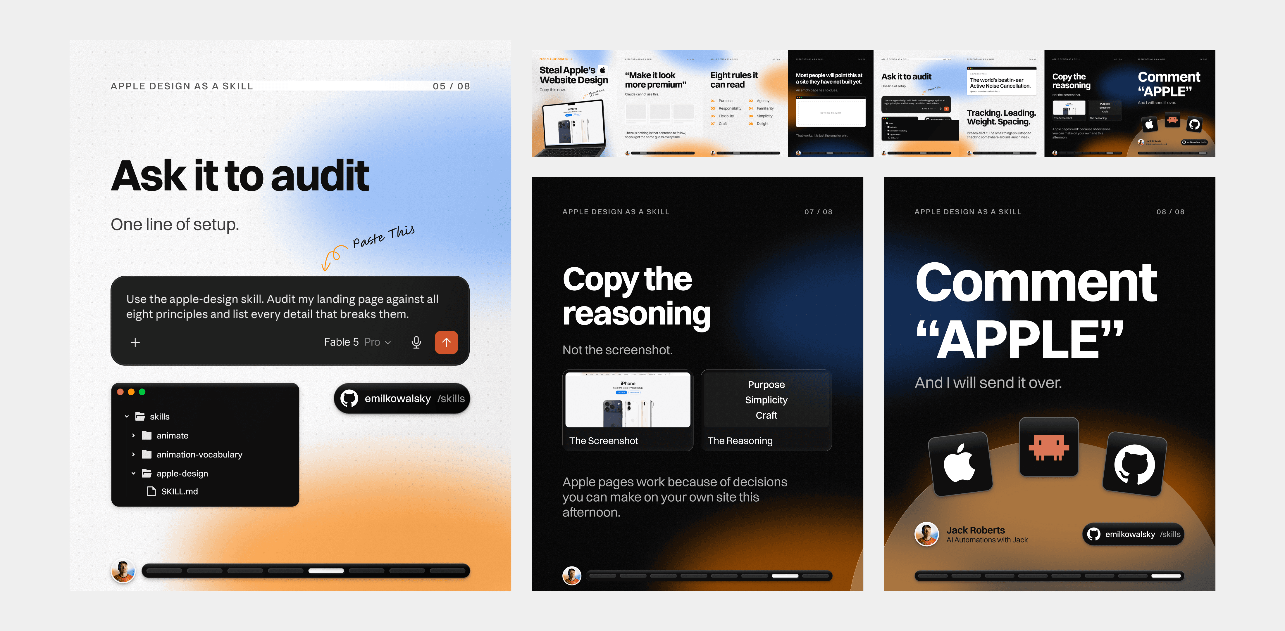
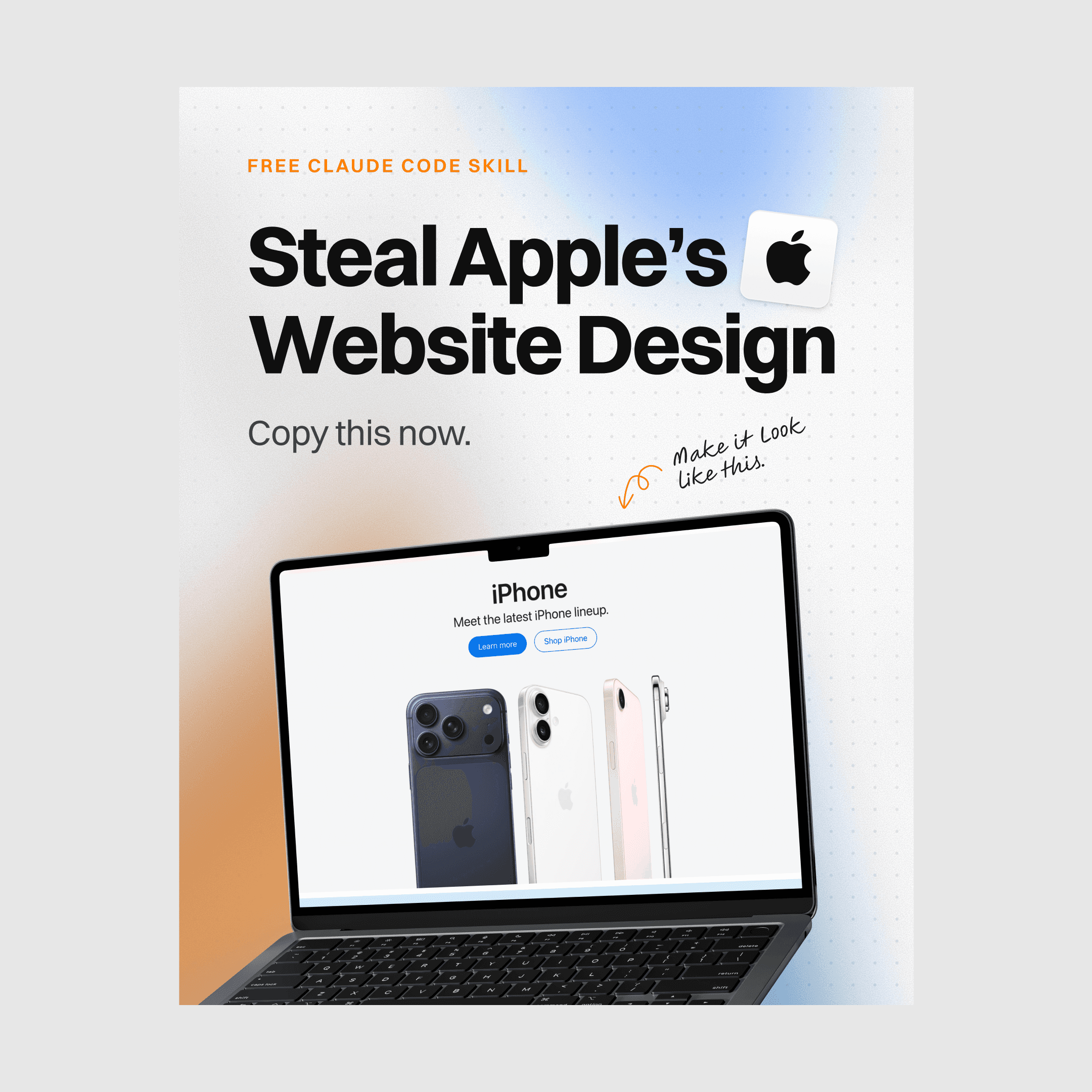
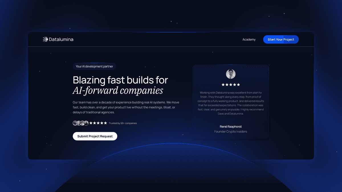
We built Jack a brand identity system with no logo at the center. His face is the logo, and everything else exists to make that face instantly recognizable at any size, on any platform. We explored multiple directions and presented them as a proper identity deck. The chosen route, Horizon, is built on three words (warm, approachable, confident) with a gradient glow behind the portrait engineered for one job: making people stop scrolling and hit subscribe.
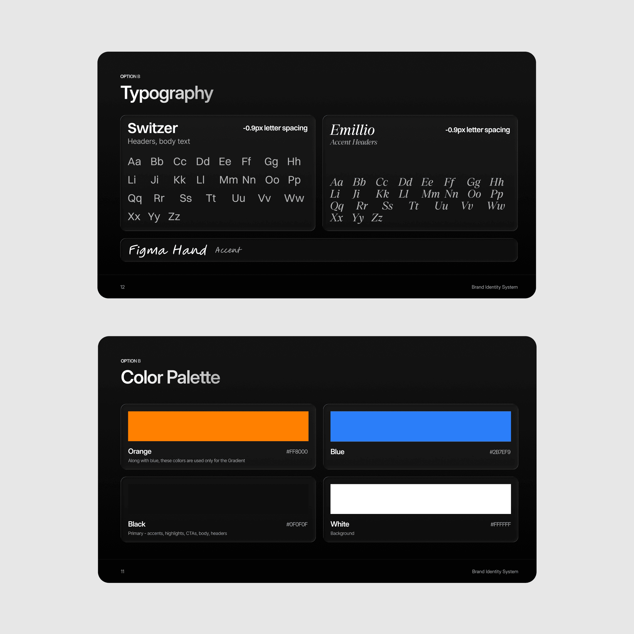
The system is held together by discipline. A four-color palette, strictly assigned: orange and blue live only in the signature gradient, black carries accents, CTAs, and type, and white is the background. When only one thing glows, you know whose content you’re looking at. A typography stack with a personality split pairs Switzer for structure with an italic serif accent and a handwritten face for annotations: confident structure with a human hand on top. On top of that sits a platform-specific portrait system: the full gradient for YouTube, a warm orange treatment for LinkedIn, a clean white version for quiet contexts, plus a full asset kit of icons, gradient shapes, hand-drawn arrows, shadows, and textures, organized in Figma and marked ready for production.